CSS
Art Week 1
Announcements
- Welcome to IDS-101-13: Thinking Machines!
- We learned a wee bit of .md.
- We learned a smidgen of html
- Time for a tad of CSS.
- Calvin's Stylin' Sheets
- Also called, Cascading Style Sheets
- CSS is a way to make HTML pretty.
- Or just to make pretty, in general.
Citation Needed
- I am hopelessly derivative.
- Today's lecture by Yosra Emad.
- Here is the original

Our goal
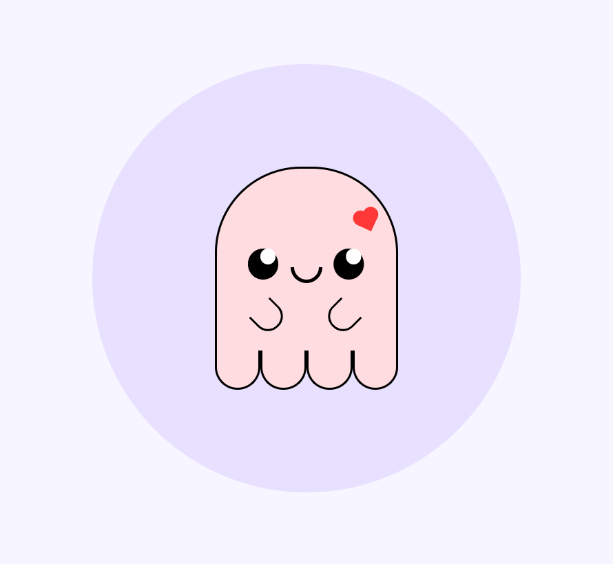
- Cute ghost.
 ?
?
Process
- Sketching
- Basic Sketch
- Splitting the sketch into layers
- Code
- HTML
- Positioning
- Responsiveness
- CSS
Sketching
- I'd usually pop open good ole paint here.
- Love me some paint.
- Shout out paint.
- Paint and I go way back.
- Oh look a whiteboard.

Splitting your Sketch into layers
- I happened to yolo this lil spooker in a few stages
- Those stages are layers.
- Like in a terrestrial planet, or a particulary good meme.

- I named by layers: self, peepers, snoot, wagglers, and feets. I missed the sides. Whoops.
The Yorsa Method
- Planning how your HTML div tags will be structured to fit your needs for this CSS art.
- The root div is called "canva"
- A "circle" layer behind the main CSS art to make it pop.
- Any two layers that are next to each other (not stacked on top of each other)
- Separate them by adding each one in its own "bubble"
- Look at self and feets; they are next to each other; they don't overlap.)
- Separate them by adding each one in its own "bubble"
- If something is too simple to have its own layer, don't name it.
- See the peepers layer, there is a pupil inside the peepers that isn't considered separately.
HTML
- Layers are <div>'s
- "div" is just what web designers use for everything, possible for a reason (I bet the reason is "because").
- Like lists or lambdas, we can put divs inside of other divs.
- Here's what it looks like:
- "self" and "feets" are adjacent (equally indented).
- "self" and "feets" are on top of "circle", the background.
FULL HTML
Positioning
- To make good CSS art, you must understand positioning very well.
- The rule in CSS art is simple.
- We will use a variety of tactics in CSS to position our feets and wagglers in appropriately cute locales.
Step One: *
- * refers to everything.
- We want all our HTML art to have no margins or stretching
- To do just what we write down (it's easier)
- This isn't necessarily true by default, so we do:
* { margin: 0; padding: 0; } - This is called a "rule", and now all HTML things will have no margins.
- Easy is good thumbs emoji.
Canva
|
.canva {
  background: #f7f5ff;
  height: 100vh;
  width: 100vw;
  display: flex;
  align-items: center;
  justify-content: center;
  position: relative;
} |
Circle
|
.circle {
  width: 70vmin;
  height: 70vmin;
  background: #e8e0ff;
  border-radius: 50%;
  display: flex;
  align-items: center;
  justify-content: center;
  flex-direction: column;
} |
Ghost
|
.ghost {
  position: relative;
  border: 0.5vmin solid black;
  width: 30vmin;
  height: 30vmin;
  border-top-left-radius: 50%;
  border-top-right-radius: 50%;
  border-bottom: 0;
  box-sizing: border-box;
  background: #FFDCDF;
} |
Ghost
|
.ghost {
  position: relative;
  border: 0.5vmin solid black;
  width: 30vmin;
  height: 30vmin;
  border-bottom: 0;
  box-sizing: border-box;
  background: #FFDCDF;
} |
Feets
|
.feets {
  display: flex;
  width: 30vmin;
}

.feets div {
  width: 7.5vmin;
  height: 6vmin;
  border: 0.5vmin solid black;
  border-bottom-left-radius: 50%;
  border-bottom-right-radius: 50%;
  border-top: 0;
  background: #FFDCDF;
} |
Peepers
|
.peepers {
  position: absolute;
  width: 5vmin;
  height: 5vmin;
  background: #000;
  border-radius: 50%;
  top: 13vmin;
  left: 5vmin;
  box-shadow: 14vmin 0;
} |
Peepers
|
.peepers:before{
  content: "";
  position: absolute;
  background: white;
  width: 2.5vmin;
  height: 2.5vmin;
  border-radius: 50%;
  left: 2vmin;
  box-shadow: 14vmin 0 white;
} |
Snoot
|
.snoot {
  position: absolute;
  width: 4vmin;
  height: 2vmin;
  border: 0.7vmin solid black;
  border-bottom-left-radius: 4vmin;
  border-bottom-right-radius: 4vmin;
  border-top: 0;
  top: 16vmin;
  left: 12vmin;
}
|
Wagglers
|
.left-waggler, .right-waggler {
  position: absolute;
  width: 4vmin;
  height: 4vmin;
  border: 0.5vmin solid black;
  border-bottom-left-radius: 50%;
  border-bottom-right-radius: 50%;
  border-top: 0;
}
|
Wagglers
|
.left-waggler {
  top: 22vmin;
  left: 6vmin;
  transform: rotate(-45deg)
}
.right-waggler{
  top: 22vmin;
  left: 18vmin;
  transform: rotate(45deg)
}
|
FIN
- Well I had a blast, I got to:
- Place fun shapes on a screen
- Use pretty colors
- Use words to describe what each feature is called.
- Be precise and iterative - I can make no mistakes!
- Following along with someone else's artist process.
Big thank you to Yosra!
NEXT TIME
- We're going to a musuem.
- Be ready for visual critique.
- Be ready to have fun.