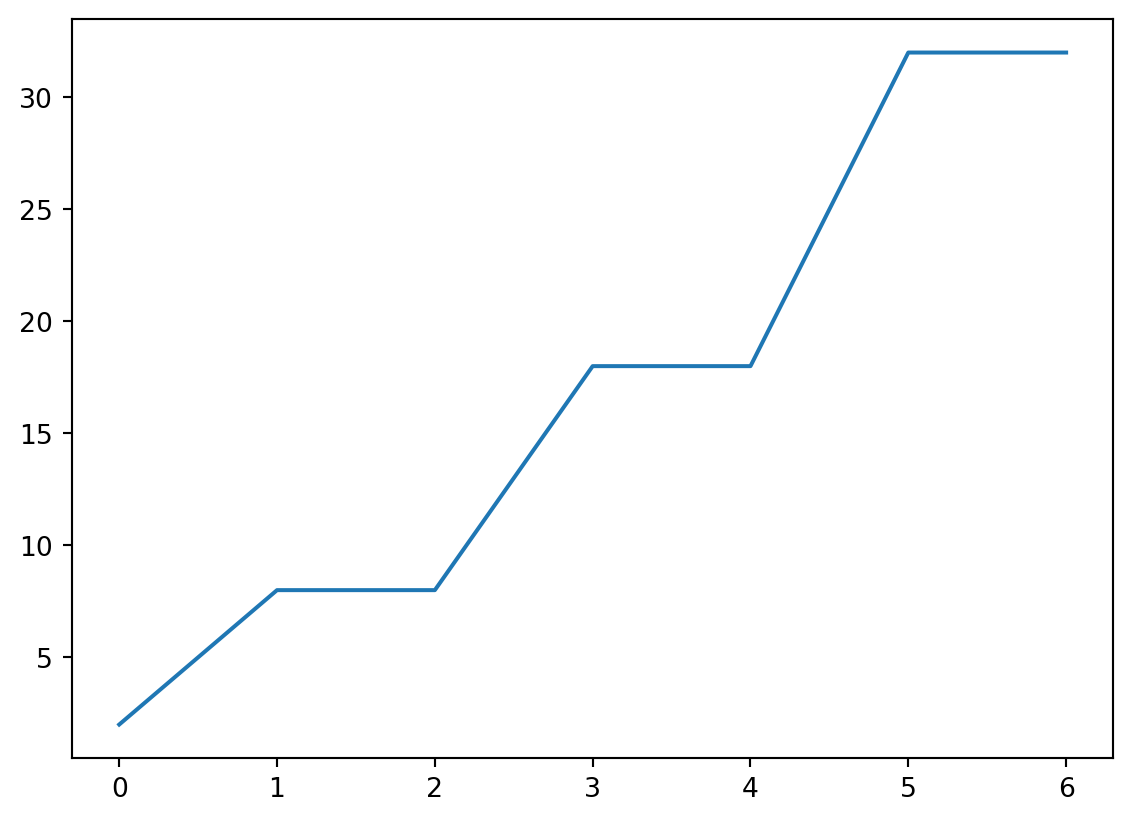
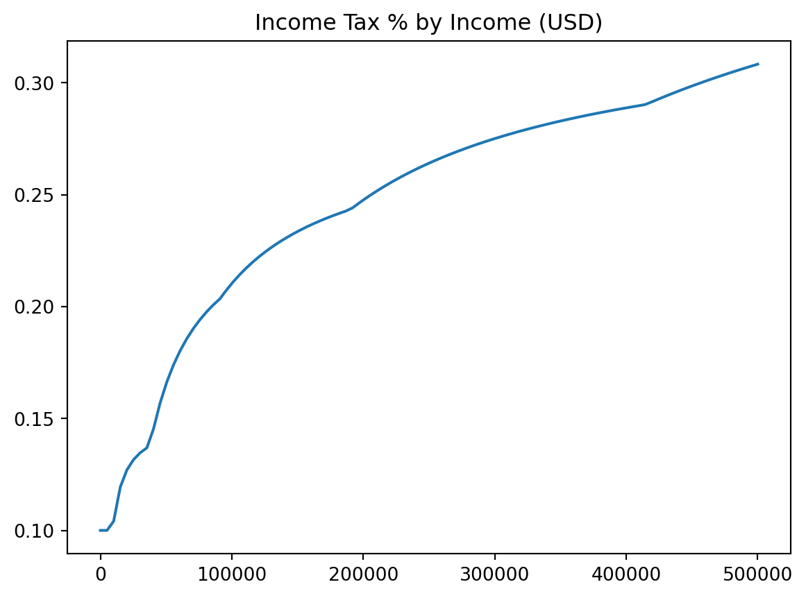
plt.title("Income Tax % by Income (USD)")plt.plot(incomes, costs / incomes)
plt.xlabel and plt.ylabel
plt.title("Income Tax % by Income (USD)")plt.xlabel("Income in USD")plt.ylabel("Percent Tax Rate")plt.plot(incomes, costs / incomes)
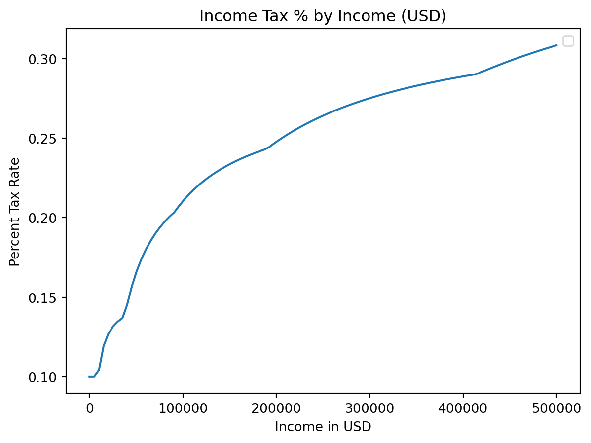
plt.legend
plt.title("Income Tax % by Income (USD)")plt.xlabel("Income in USD")plt.ylabel("Percent Tax Rate")plt.plot(incomes, costs / incomes)plt.legend() # We didn't label any of our plots!
C:\Users\cd-desk\AppData\Local\Temp\ipykernel_20228\1652991527.py:5: UserWarning:
No artists with labels found to put in legend. Note that artists whose label start with an underscore are ignored when legend() is called with no argument.
label=
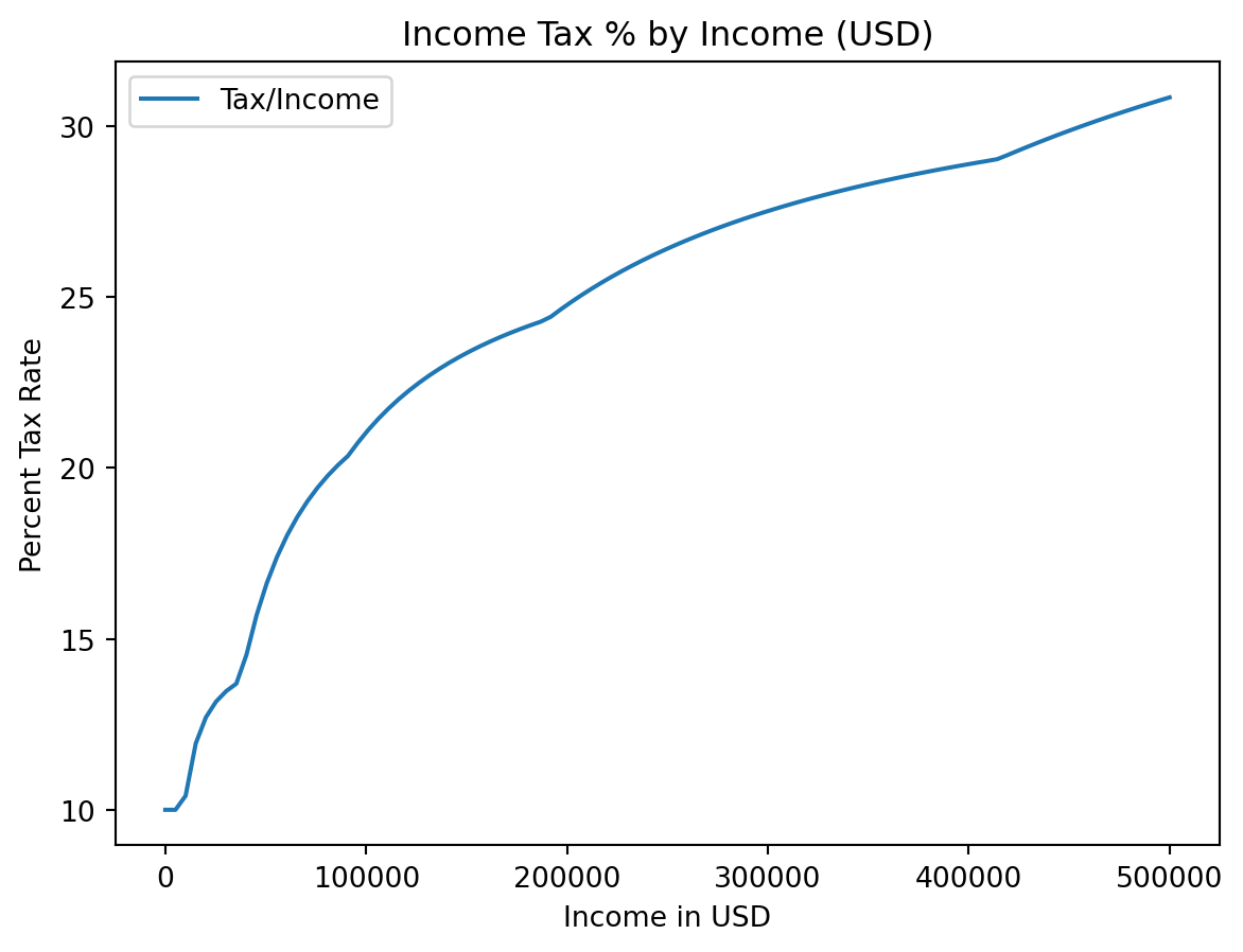
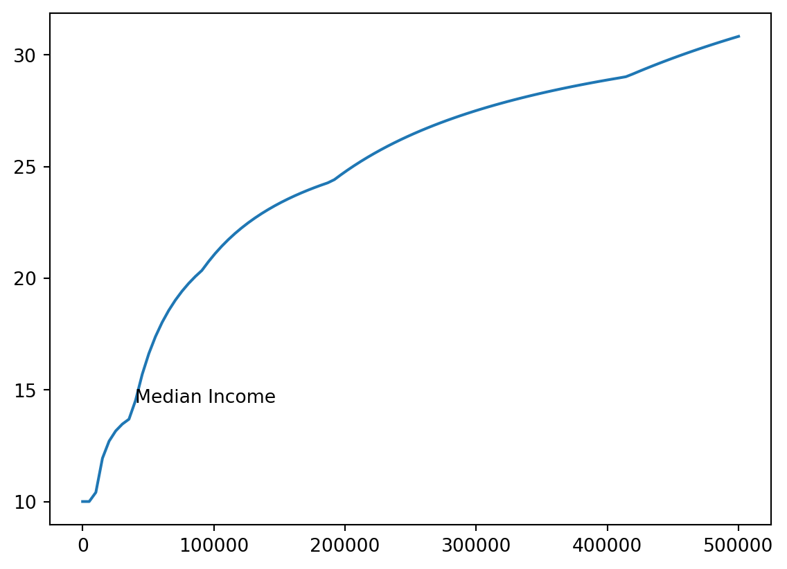
plt.title("Income Tax % by Income (USD)")plt.xlabel("Income in USD")plt.ylabel("Percent Tax Rate")plt.plot(incomes, costs / incomes *100, label ="Tax/Income")plt.legend() # This shows the labels
Annotation
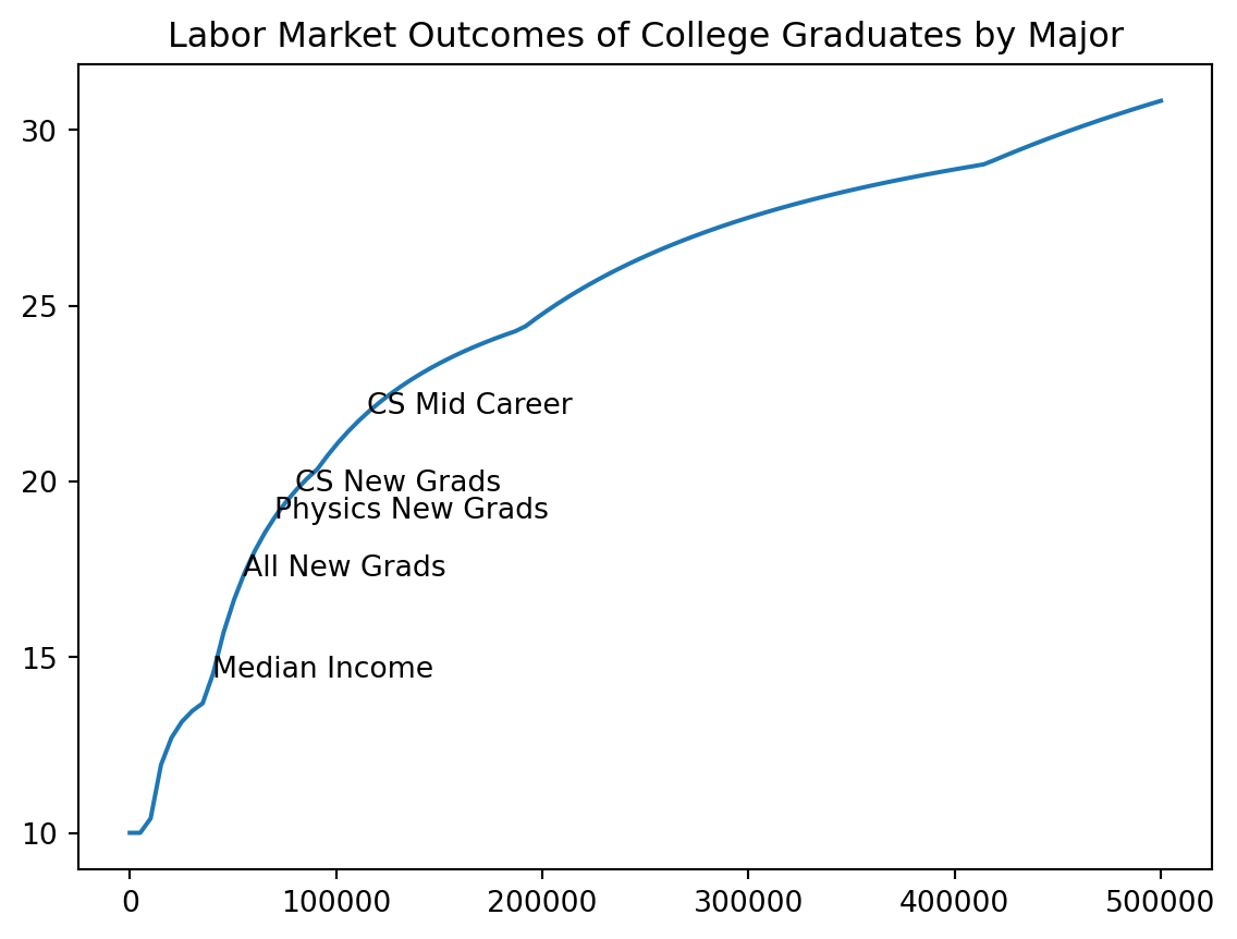
We’ll add a note where median income (about 40k) is.
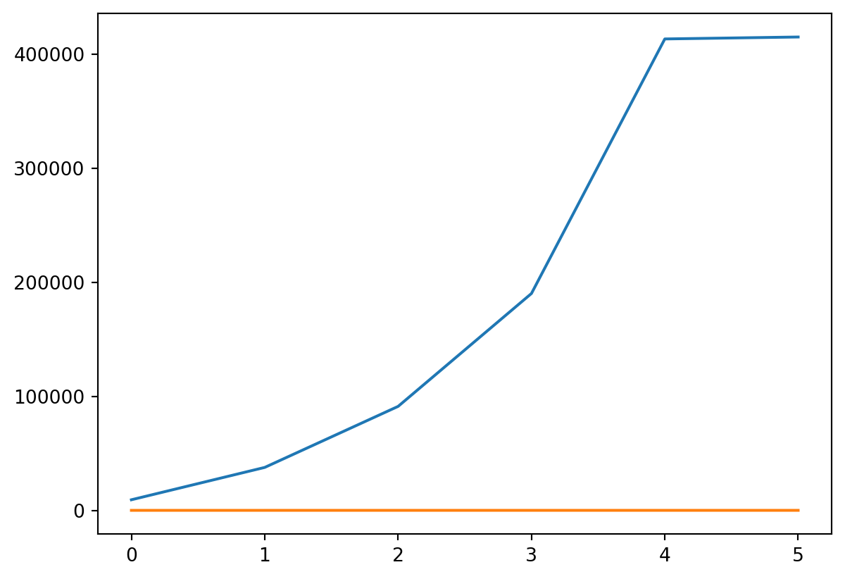
plt.plot(incomes, costs / incomes *100, label ="Tax/Income")add_note(115000, "CS Mid Career")add_note(80000, "CS New Grads")add_note(70000, "Physics New Grads")add_note(55000, "All New Grads")add_note(40000, "Median Income")plt.title("Labor Market Outcomes of College Graduates by Major")
Text(0.5, 1.0, 'Labor Market Outcomes of College Graduates by Major')
Multiple Functions
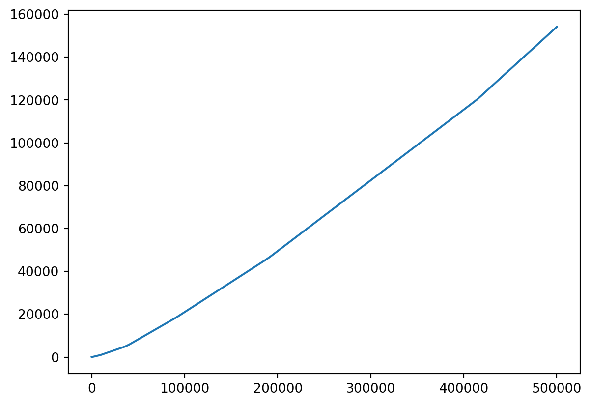
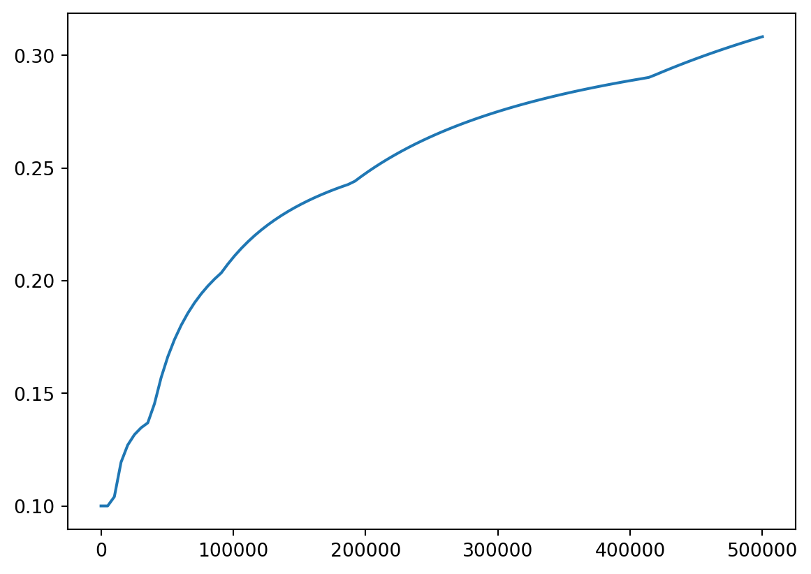
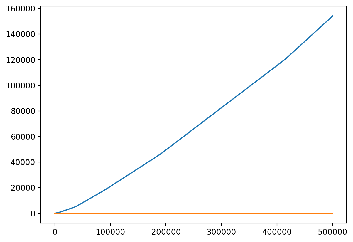
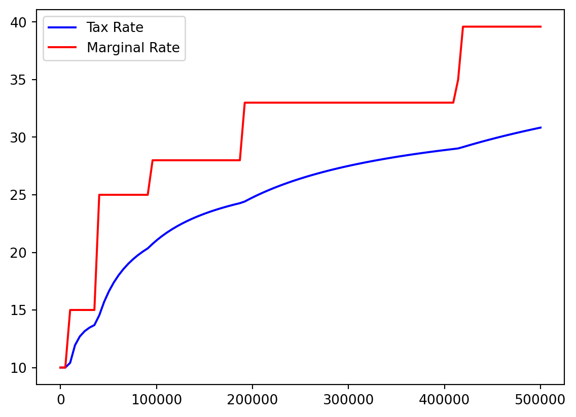
I think it would be helpful to see actual tax percentage versus marginal tax percentage.
Those outermost electrons in an atom have to be somewhere.
Using the aforementioned plotly, it is possible to plot these orbitals interactively in 3D
Code
import plotly.graph_objects as go# --- Constants and Orbital Parameters ---# Atomic number (Z) for the hydrogenic atom.# Z=1 for Hydrogen. You can change this to visualize for other single-electron ions.Z =1# Principal quantum number (n) for the 3d orbital.n =3# --- Radial Wavefunction R_3d(r, Z) ---# This function calculates the radial part of the 3d orbital wavefunction.# It is based on the formula provided by the user:# R3d = (1/9√30) × ρ^2 × Z^(3/2) × e^(-ρ/2)# where ρ (rho) is defined as 2 * Z * r / n for hydrogenic atoms.def R_3d(r, Z_val):""" Calculates the radial part of the 3d orbital wavefunction. Args: r (numpy.ndarray): Radial distance from the nucleus. Z_val (int): Atomic number. Returns: numpy.ndarray: The value of the radial wavefunction at distance r. """# Calculate rho based on the principal quantum number (n=3 for 3d) rho =2* Z_val * r / n# The constant factor from the user's formula constant_factor =1/ (9* np.sqrt(30))# Calculate the radial part according to the user's formula# Handles potential division by zero or NaN values if r is zero,# as rho will be zero, leading to rho**2 = 0 and exp(-0) = 1. radial_part = constant_factor * (rho**2) * (Z_val**(3/2)) * np.exp(-rho /2)return radial_part# --- Angular Wavefunction Y_3dz2(theta) ---# This function calculates the angular part of the 3d_z^2 orbital wavefunction.# It is based on the formula provided by the user:# Y3dz2 = √(5/4) × (3z^2 – r^2)/r^2 × (1/4π)^1/2# This simplifies to √(5/16π) * (3cos^2(theta) - 1), where theta is the polar angle.def Y_3dz2(theta):""" Calculates the angular part of the 3d_z^2 orbital wavefunction. Args: theta (numpy.ndarray): Polar angle (angle from the positive z-axis). Returns: numpy.ndarray: The value of the angular wavefunction at angle theta. """# The constant factor from the user's formula, simplified constant_factor = np.sqrt(5/ (16* np.pi))# Calculate the angular part angular_part = constant_factor * (3* np.cos(theta)**2-1)return angular_part# --- Create 3D Grid for Visualization ---# Define the resolution of the 3D grid. Higher values mean better detail but slower computation.grid_points =60# Number of points along each axis (x, y, z)max_range =25# Maximum extent of the plot in each direction (arbitrary units, e.g., Bohr radii)# Create 1D arrays for x, y, and z coordinatesx_coords = np.linspace(-max_range, max_range, grid_points)y_coords = np.linspace(-max_range, max_range, grid_points)z_coords = np.linspace(-max_range, max_range, grid_points)# Create a 3D meshgrid from the 1D coordinate arrays# 'indexing='ij'' ensures that X, Y, Z_grid have shapes (grid_points, grid_points, grid_points)# Z_grid is renamed to avoid conflict with the atomic number Z.X, Y, Z_grid = np.meshgrid(x_coords, y_coords, z_coords, indexing='ij')# --- Convert Cartesian to Spherical Coordinates ---# Calculate radial distance (r)r = np.sqrt(X**2+ Y**2+ Z_grid**2)# Calculate polar angle (theta)# Using arctan2(sqrt(x^2+y^2), z) is more numerically stable than arccos(z/r)# as it handles cases where r is zero or very small more gracefully.r_xy_plane = np.sqrt(X**2+ Y**2)theta = np.arctan2(r_xy_plane, Z_grid)# --- Calculate the Full Wavefunction (psi) ---# The full wavefunction is the product of the radial and angular parts.# Handle potential runtime warnings for very small r values if they lead to issues.# np.where is used to prevent division by zero for r=0 in R_3d, although the current R_3d# implementation handles it gracefully. It's a good practice for general cases.psi = np.where(r ==0, 0, R_3d(r, Z) * Y_3dz2(theta))# --- Determine Isosurface Thresholds ---# To visualize the shape of the orbital, we plot isosurfaces of the wavefunction (psi).# The 3d_z^2 orbital has positive lobes along the z-axis and a negative toroidal (donut) lobe# in the xy-plane. We will plot two isosurfaces: one for a positive psi value and one for a# negative psi value to represent these lobes.## We find the maximum absolute value of psi to set a reasonable threshold.# The threshold determines the 'size' or 'extent' of the visualized orbital lobes.max_abs_psi = np.max(np.abs(psi))# Adjust this factor (e.g., 0.05 to 0.2) to change the size of the rendered orbital.# A smaller factor will show a larger, more diffuse orbital.threshold = max_abs_psi *0.08# --- Create Plotly Figure ---fig = go.Figure(data=[# Isosurface for the positive lobe (e.g., blue color) go.Isosurface( x=X.flatten(), y=Y.flatten(), z=Z_grid.flatten(), value=psi.flatten(), isomin=threshold, # Only show values at or above this positive threshold isomax=threshold, # Create a single surface at this threshold surface_count=1, # Draw only one surface for this data trace caps=dict(x_show=False, y_show=False, z_show=False), # Hide caps for a cleaner look colorscale=[[0, 'blue'], [1, 'blue']], # Solid blue color for positive lobe showscale=False, # Hide the color scale bar opacity=0.6, # Transparency of the surface name='Positive Lobe (ψ > 0)', # Name for legend showlegend=True# Show this trace in the legend ),# Isosurface for the negative lobe (e.g., red color) go.Isosurface( x=X.flatten(), y=Y.flatten(), z=Z_grid.flatten(), value=psi.flatten(), isomin=-threshold, # Only show values at or below this negative threshold isomax=-threshold, # Create a single surface at this threshold surface_count=1, caps=dict(x_show=False, y_show=False, z_show=False), colorscale=[[0, 'red'], [1, 'red']], # Solid red color for negative lobe showscale=False, opacity=0.6, name='Negative Lobe (ψ < 0)', # Name for legend showlegend=True )])# --- Update Layout and Scene Settings ---fig.update_layout( title=f'Interactive 3d_z² Orbital Visualization (Z={Z})', # Title of the plot# --- Add or modify these lines for a dark theme --- paper_bgcolor='rgba(0,0,0,0)', # Dark background for the entire figure plot_bgcolor='rgba(0,0,0,0)', # Dark background for the plotting area font=dict(color='white'), # White font color for better contrast scene=dict( xaxis_title='X', # X-axis label yaxis_title='Y', # Y-axis label zaxis_title='Z', # Z-axis label aspectmode='cube', # Ensures equal scaling for all axes for correct shape representation# Optionally set camera position for initial view xaxis=dict( backgroundcolor="rgba(0,0,0,0)", # Transparent background for axis planes gridcolor="gray", # Gray grid lines zerolinecolor="white"# White zero line ), yaxis=dict( backgroundcolor="rgba(0,0,0,0)", gridcolor="gray", zerolinecolor="white" ), zaxis=dict( backgroundcolor="rgba(0,0,0,0)", gridcolor="gray", zerolinecolor="white" ), camera=dict( eye=dict(x=1.5, y=1.5, z=1.5) # Adjust camera angle for better initial view ) ), margin=dict(l=0, r=0, b=0, t=40), # Adjust margins height=700, # Height of the plot width=700, # Width of the plot hovermode=False, # Disable hover to improve performance on large datasets legend=dict( x=0.01, y=0.99, bgcolor='rgba(255,255,255,0.7)', bordercolor='Black', borderwidth=1 ))