Once you have done more CSS, take this out and see what happens.
We use the special * asterisk to apply the style to all elements.
styles.css
/* This is a CSS Comment *//* Like <!-- --> HTML comments *//* Remove margins and stretching */* {margin:0;padding:0;}
Step 2 ⬜
Style base.
This background color
100% visible height vh and width vw
Flex means “not inline text”
We aren’t using text!
We center everything relative to this div
styles.css
/* Old */* {margin:0;padding:0;}/* New! */#base {background:white;height:100vh;width:100vw;display:flex;align-items:center;justify-content:center;position:relative;}
Step 3 🟣
The circle behind the spookster.
70% of the SMALLER of the height and width
Border radius is neat - we’ll demo it.
#e8e0ff is this color
And again center everything.
styles.css
/* Only showing new stuff... */#background {width:70vmin;height:70vmin;background:#e8e0ff;border-radius:50%;display:flex;align-items:center;justify-content:center;flex-direction:column;}
Aside: Border Radius
We can clip the borders of elements with backgrounds to be round instead of square with a radius.
/* Only showing new stuff... */#spookster {position:relative;border:0.5vminsolidblack;width:30vmin;height:30vmin;border-top-left-radius:50%;border-top-right-radius:50%;border-bottom:0;box-sizing:border-box;background:#ffdcff;}
👀 Visually
It will mostly look like this:
Aside: Border Radius
Here it is without the border radius set.
Step 5 🐾
We create a <div> to hold for 4 feet and also those 4 feet
Each foot is 1/4 of ghost width.
Rounded and outlined on the bottom.
There are four of these!
Black border except top!
#e8e0ff is this color
styles.css
/* Only showing new stuff... */#feets {display:flex;width:30vmin;}#feet {width:7.5vmin;height:6vmin;border:0.5vminsolidblack;border-bottom-left-radius:50%;border-bottom-right-radius:50%;border-top:0;background:#ffdcff;}
👀 Visually
It will mostly look like this:
Aside: Partial Borders
If we don’t set border-top: 0:
Step 6 👁️
Peepers are just two circles at a fixed location.
5% (1/6 of ghost) radius
A lot down (13%) and a little bit to the left (5%)
Then add a shadow (the other eye) 14% to the right.
Phew!
styles.css
/* Only showing new stuff... */#peepers {position:absolute;width:5vmin;height:5vmin;background:#000;border-radius:50%;top:13vmin;left:5vmin;box-shadow:14vmin0;}
👀 Visually
It will mostly look like this:
Step \(n\) 🎨
I’ll simply provide the rest for you to play with!
You can scroll!
styles.css
/* the :before allows *//* 2 styles to one div *//* Whites of the eyes */#peepers:before{content:"";position:absolute;background:white;width:2.5vmin;height:2.5vmin;border-radius:50%;left:2vmin;box-shadow:14vmin0white;}#snoot {position:absolute;width:4vmin;height:2vmin;border:0.7vminsolidblack;border-bottom-left-radius:4vmin;border-bottom-right-radius:4vmin;border-top:0;top:16vmin;left:12vmin;}/* Both wagglers (hands) have *//* much in common */#left-waggler,#right-waggler {position:absolute;width:4vmin;height:4vmin;border:0.5vminsolidblack;border-bottom-left-radius:50%;border-bottom-right-radius:50%;border-top:0;}/* But are in different *//* 1. locations and *//* 2. orientations */#left-waggler {top:22vmin;left:6vmin;transform:rotate(-45deg)}#right-waggler{top:22vmin;left:18vmin;transform:rotate(45deg)}
---title: 🖼 Art!---<link rel="stylesheet" href="css/spookster.css"># 👋 Introduction## Goals1. Create a *webpage*2. Make it *well-formed*3. Make it *stylish*4. **Make it *graphical***5. Make it *interactive*## Today- [ ] Backgrounds!- [ ] Radii!- [ ] Positioning!# 👻 Spooky## What?- [Yosra Emad](https://yosracodes.hashnode.dev/how-i-make-css-art), cool CSS artist/coder made this: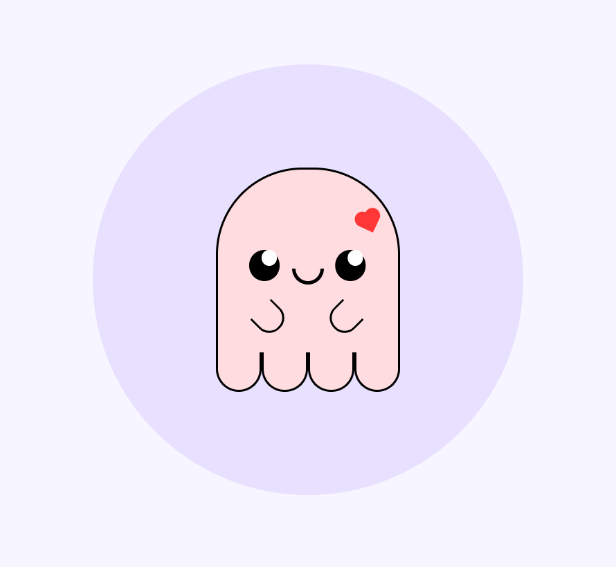## How?- Yosra: - Creates HTML elements for each "part" of the art. - Uses CSS styling to change colors and borders. - We will do the same!## Why?- It's cute!# 💀 Skeleton## What?::::{.columns}:::{.column width="50%"}- First, make the skeleton of the structure by looking for *layers* from *back* to front.- We notice, for example, there could be a back-most circle element forming the body.- Use the `<div>` element - a very general "division" of website content. - We will use *no content at all* - only style the `<div>`::::::{.column width="50%"}:::::::## How?- Yosra recommends, and I follow, as:::::{.columns}:::{.column width="50%"}```{.html filename="spooky.html"}<div id="base"> <div id="background"> <div id="spookster"> <div id="peepers"></div> <!-- Short for booplesnoot --> <div id="snoot"></div> <div id="left-waggler"></div> <div id="right-waggler"></div> </div> <div id="feets"> <div id="feet"></div> <div id="feet"></div> <div id="feet"></div> <div id="feet"></div> </div> </div></div>```::::::{.column width="50%"}:::::::## Citation needed::::{.columns}:::{.column width="50%"}- Booplesnoot and other part names are a throwback to a [legendary meme](https://www.reddit.com/r/funny/comments/1lqfi8/my_new_bunny_doesnt_have_a_name_but_these_are/) of a bunny.::::::{.column width="50%"}:::::::## Why?- By default, HTML styles enclosed elements on top of enclosing elements.- So we can place, e.g., eyes on a smiley face like so:```{.html filename="smiley.html"}<div id="face"> <div id="left-eye"></div> <div id="right-eye"></div> <div id="mouth"></div></div>```# 🪜 Steps to Spook## Step 0 🏁- Recall we will be working with `spooky.html`- Recall we need to link our CSS stylesheet in the header```{.html filename="spooky.html"}<!DOCTYPE html><html> <head> <link rel="stylesheet" href="styles.css"> </head> <body> <div id="base"> <div id="background"> <div id="spookster"> <div id="peepers"></div> ...```## Step 1 1️⃣::::{.columns}:::{.column width="50%"}- We will remove all *margins* and *stretching*. - Once you have done more CSS, take this out and see what happens.- We use the special `*` asterisk to apply the style to *all* elements.::::::{.column width="50%"}```{.css filename="styles.css"}/* This is a CSS Comment *//* Like <!-- --> HTML comments *//* Remove margins and stretching */* { margin: 0; padding: 0;}```:::::::## Step 2 ⬜::::{.columns}:::{.column width="50%"}- Style base.- <span style="background-color:white;color:black">This background color</span>- 100% visible height `vh` and width `vw`- Flex means "not inline text" - We aren't using text!- We center everything relative to this div::::::{.column width="50%"}```{.css filename="styles.css"}/* Old */* { margin: 0; padding: 0;}/* New! */#base { background: white; height: 100vh; width: 100vw; display: flex; align-items: center; justify-content: center; position: relative;}```:::::::## Step 3 🟣::::{.columns}:::{.column width="50%"}- The circle behind the spookster.- 70% of the SMALLER of the height and width- Border radius is neat - we'll demo it.- `#e8e0ff` is <span style="color:#e8e0ff;background:black">this color</span>- And again center everything.::::::{.column width="50%"}```{.css filename="styles.css"}/* Only showing new stuff... */#background { width: 70vmin; height: 70vmin; background: #e8e0ff; border-radius: 50%; display: flex; align-items: center; justify-content: center; flex-direction: column;}```:::::::## Aside: Border Radius- We can clip the borders of elements with backgrounds to be round instead of square with a radius.::::{.columns}:::{.column width="25%"}- 0%```{.html}<div style="background:red;border-radius:0%;text-align:center">Text</div>```<div style="background:red;border-radius:0%;text-align:center">Text</div>::::::{.column width="25%"}- 10%```{.html}<div style="background:red;border-radius:10%;text-align:center">Text</div>```<div style="background:red;border-radius:10%;text-align:center">Text</div>::::::{.column width="25%"}- 25%```{.html}<div style="background:red;border-radius:25%;text-align:center">Text</div>```<div style="background:red;border-radius:25%;text-align:center">Text</div>::::::{.column width="25%"}- 50%```{.html}<div style="background:red;border-radius:50%;text-align:center">Text</div>```<div style="background:red;border-radius:50%;text-align:center">Text</div>:::::::## Step 4 🧢::::{.columns}:::{.column width="50%"}- The spookster herself.- 30% of the SMALLER of the height and width- Border radius but only on top!- Black border but not one the bottom!- `#e8e0ff` is <span style="color:#ffdcff;background:black">this color</span>::::::{.column width="50%"}```{.css filename="styles.css"}/* Only showing new stuff... */#spookster { position: relative; border: 0.5vmin solid black; width: 30vmin; height: 30vmin; border-top-left-radius: 50%; border-top-right-radius: 50%; border-bottom: 0; box-sizing: border-box; background: #ffdcff;}```:::::::## 👀 Visually- It will mostly look like this:```{=html}<div id="base"> <div id="background"> <div id="spookster"></div> </div></div>```## Aside: Border Radius- Here it is without the border radius set.```{=html}<div id="base"> <div id="background"> <div id="spookster" style="border-radius:0%"></div> </div></div>```## Step 5 🐾::::{.columns}:::{.column width="50%"}- We create a `<div>` to hold for 4 feet and also those 4 feet- Each foot is 1/4 of ghost width.- Rounded and outlined on the bottom.- There are four of these!- Black border except top!- `#e8e0ff` is <span style="color:#ffdcff;background:black">this color</span>::::::{.column width="50%"}```{.css filename="styles.css"}/* Only showing new stuff... */#feets { display: flex; width: 30vmin;}#feet { width: 7.5vmin; height: 6vmin; border: 0.5vmin solid black; border-bottom-left-radius: 50%; border-bottom-right-radius: 50%; border-top: 0; background: #ffdcff;}```:::::::## 👀 Visually- It will mostly look like this:```{=html}<div id="base"> <div id="background"> <div id="spookster"></div> <div id="feets"> <div id="feet"></div> <div id="feet"></div> <div id="feet"></div> <div id="feet"></div> </div> </div></div>```## Aside: Partial Borders- If we *don't* set `border-top: 0`:```{=html}<div id="base"> <div id="background"> <div id="spookster"></div> <div id="feets"> <div id="feet" style="border: 0.25vmin solid black;"></div> <div id="feet" style="border: 0.25vmin solid black;"></div> <div id="feet" style="border: 0.25vmin solid black;"></div> <div id="feet" style="border: 0.25vmin solid black;"></div> </div> </div></div>```## Step 6 👁️::::{.columns}:::{.column width="50%"}- Peepers are just two circles at a fixed location. - 5% (1/6 of ghost) radius- A lot down (13%) and a little bit to the left (5%)- Then add a shadow (the other eye) 14% to the right.- *Phew!*::::::{.column width="50%"}```{.css filename="styles.css"}/* Only showing new stuff... */#peepers { position: absolute; width: 5vmin; height: 5vmin; background: #000; border-radius: 50%; top: 13vmin; left: 5vmin; box-shadow: 14vmin 0;}```:::::::## 👀 Visually- It will mostly look like this:```{=html}<div id="base"> <div id="background"> <div id="spookster"> <div id="peepers"></div> </div> <div id="feets"> <div id="feet"></div> <div id="feet"></div> <div id="feet"></div> <div id="feet"></div> </div> </div></div>```## Step $n$ 🎨::::{.columns}:::{.column width="50%"}- I'll simply provide the rest for you to play with!- You can scroll!::::::{.column width="50%"}```{.css filename="styles.css" code-block-height="5em"}/* the :before allows *//* 2 styles to one div *//* Whites of the eyes */#peepers:before{ content: ""; position: absolute; background: white; width: 2.5vmin; height: 2.5vmin; border-radius: 50%; left: 2vmin; box-shadow: 14vmin 0 white;}#snoot { position: absolute; width: 4vmin; height: 2vmin; border: 0.7vmin solid black; border-bottom-left-radius: 4vmin; border-bottom-right-radius: 4vmin; border-top: 0; top: 16vmin; left: 12vmin;}/* Both wagglers (hands) have *//* much in common */#left-waggler, #right-waggler { position: absolute; width: 4vmin; height: 4vmin; border: 0.5vmin solid black; border-bottom-left-radius: 50%; border-bottom-right-radius: 50%; border-top: 0;}/* But are in different */ /* 1. locations and *//* 2. orientations */#left-waggler { top: 22vmin; left: 6vmin; transform: rotate(-45deg)}#right-waggler{ top: 22vmin; left: 18vmin; transform: rotate(45deg)}```:::::::- Try it out all at once or piece-by-piece!## 👀 Visually```{=html}<div id="base"> <div id="background"> <div id="spookster"> <div id="peepers2"></div> <!-- Short for booplesnoot --> <div id="snoot"></div> <div id="left-waggler"></div> <div id="right-waggler"></div> </div> <div id="feets"> <div id="feet"></div> <div id="feet"></div> <div id="feet"></div> <div id="feet"></div> </div> </div></div>```## Demo Repo- Check it out here: - [Page](https://cd-public.github.io/spookster) - [Repo](https://github.com/cd-public/spookster)## Today- [x] Backgrounds!- [x] Radii!- [x] Positioning!

