Matplotlib
Scientific Computing
Why Matplotlib?
What’s Matplotlib?
Matplotlib is a comprehensive library for creating static, animated, and interactive visualizations.
- MATLAB Plot Library
- Based on the “industry standard” library that predates Python
- Basis of many more modern tools (namely Seaborn)
Why Matplotlib
- Versus its closest competitors (Altair, Seaborn, ggplot2, Plotly):
- Allows dramatically more control over created plots.
- Extremely good NumPy and pandas (our next library) integration.
- Wealth of resources
- Entirely free and open-source
Why not Matplotlib
- Altair and Plotly have far better web integration and interaction.
- Seaborn has beautiful defaults.
- Statisticians like ggplot2, which is from another language (R)
- Many modern data visualizations go on websites, which is not to Matplotlib’s strengths.
Relevance
- We have been working with a piecewise function for sometime!
- Can we finally visualize it?
Install
pip like NumPy
- Just like NumPy, Matplotlib is a Python package which we install via
pip
python3 -m pip install matplotlib - That might take a moment, when it does we can check it worked!
Verify
- We can quickly verify installation and introduce some conventions.
- Open up Python and import the libraries:
Plotting
- Let’s plot something
The Table

Rows
This also happens to be the maximum number of electrons in the outermost “shell” of an atom.
Plots
- Creating a naive (that is, specifying no options) plot is very easy.

- Wait a minute - we’re at the command line… where does the image go?
Command Line
- When I do this at the command line, I usually see the following:
>>> plt.plot(a)
[<matplotlib.lines.Line2D object at 0x7f34f7094cd0>]- That is… not a chart.
- No worries!
Making Charts
- My preferred way to work with charts is by saving them as an image file.
- Can include them as attachments in emails.
- Can incorporate them into scientific writing.
- Can post interesting findings on social media.
- We simply save the file.
- I always save a “.svg” file - “scalable vector graphic”
- These don’t get fuzzy when you zoom in.
Saving Charts
- I use the following to save my chart as a “.svg” image file.
Viewing Charts
- I usually exit Python to view charts, or wrote scripts that generate charts and run them at the command line.
Open Image
- On Windows, view image from terminal:
nvim chart_maker.py # code from last slide
python chart_maker.py
start my_chart.svg- On MacOS, view image from terminal:
nvim chart_maker.py # code from last slide
python3 chart_maker.py
open my_chart.svg- Should open in your default image viewer.
Reference
- Recall: We should see this:
OS
The OS package
- I often use one other
importwhen working with images. - Often times, I end up with a NumPy array where I’m trying various ways of plotting, and don’t want to close Python.
- I could open another terminal tab, but there’s another option:
Using OS
- OS let’s us do a lot of the things we do in the shell without leaving Python.
- The most useful technique is
os.system()which allows us to run a shell command from within Python. - For example, the following would open “my_chart.svg” on MacOS
On OS
- Historically, an operating system was considered synonmous with its command line.
- This is reflected within how we use the
osmodule with the requirement to usestarton Windows andopenon MacOS. - In both cases, the same file is opened in a photo viewer, but
- The command differs due to the different operating system (OS)
Use of OS
- The
osmodule has largely fallen out of favor versussubprocess, which more robust but harder to use. - As with Matplotlib vs. e.g. Altair or Seaborn, I teach the older, easier, less-snazzy version.
- In general,
osis no longer recommended for use outside of scientific computing.
Another example
- By the way, you now know how to:
- Open
nvim, write a file, and save it importthat file- Run the contents of that file to create an image and
- View the image
- Open
- All without leaving Python!
Plot Elements
Piecewise
- We return now to the income tax example to show some ways of plotting.
- Let’s recall the
taxesarray quickly.
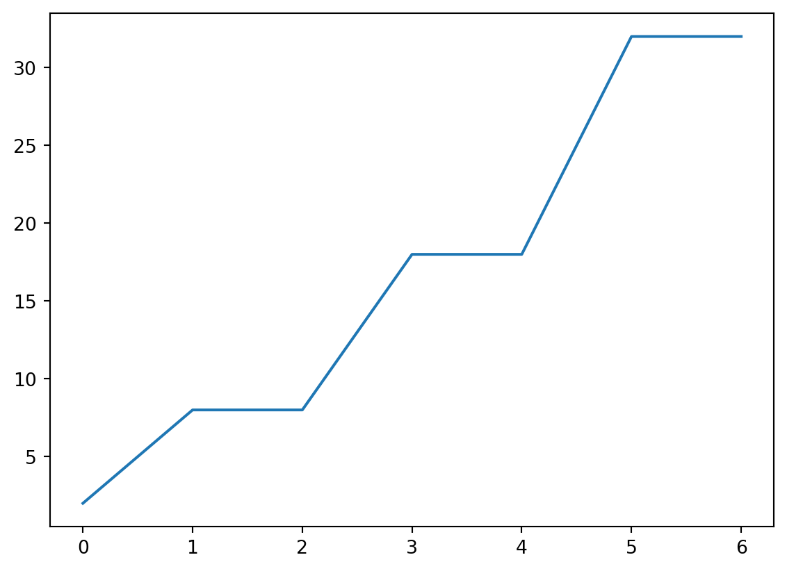
Naive Plotting
- This is probably not what we intended!
x and y
- Plot “cutoff vs rate” by providing both.

Plotting Functions
- Really though, we want to:
- Create an array of possible incomes.
- Calculate tax at that income.
- Plot that tax.
- This is plotting a function!
The function
- Spoilers for earlier exercises.
Creating Arrays
- Let’s consider some possible incomes.
- We can use
np.arange()to create a range of values using the same idea as slices- Start
- Stop
- Step
linspace
np.linspace()is a bit more common and may be easier.- Give a start, stop, and a number of values…
Aside: 0s and 1s
- More generally, we can create arrays with
np.ones()ornp.zeros() - Just provide a length.
Aside: dtype
- By default, these are floating point values.
- You can get integers by specifying a NumPy
dtype(for data type)
- Always think about whether you want round numbers or not.
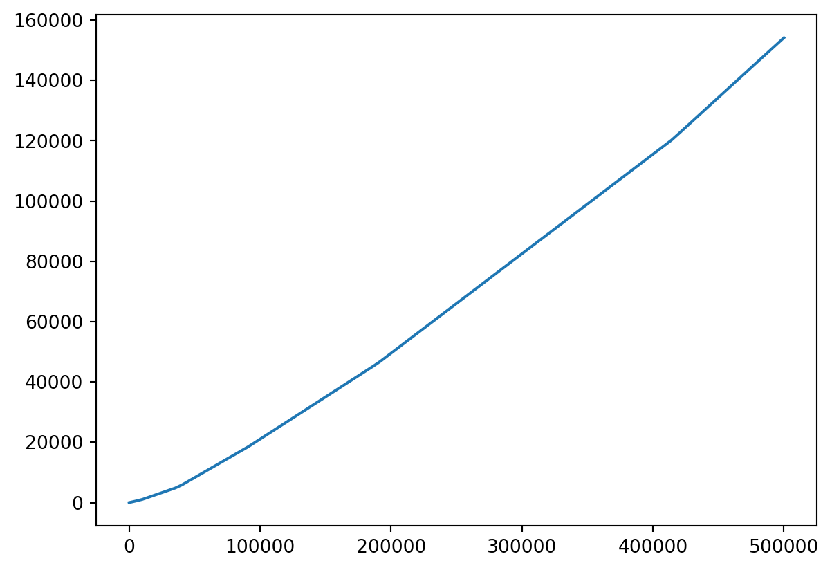
Plotting Taxation
- Let’s make a linspace from, say,
1to500000.
Vectorizing
- Unlike, say
+and-,single_taxis not a built-in, vectorized operation in NumPy. - Not to worry, we just ask NumPy to
np.vectorizeit!
Plot Vector Functions
- Let’s take a look!
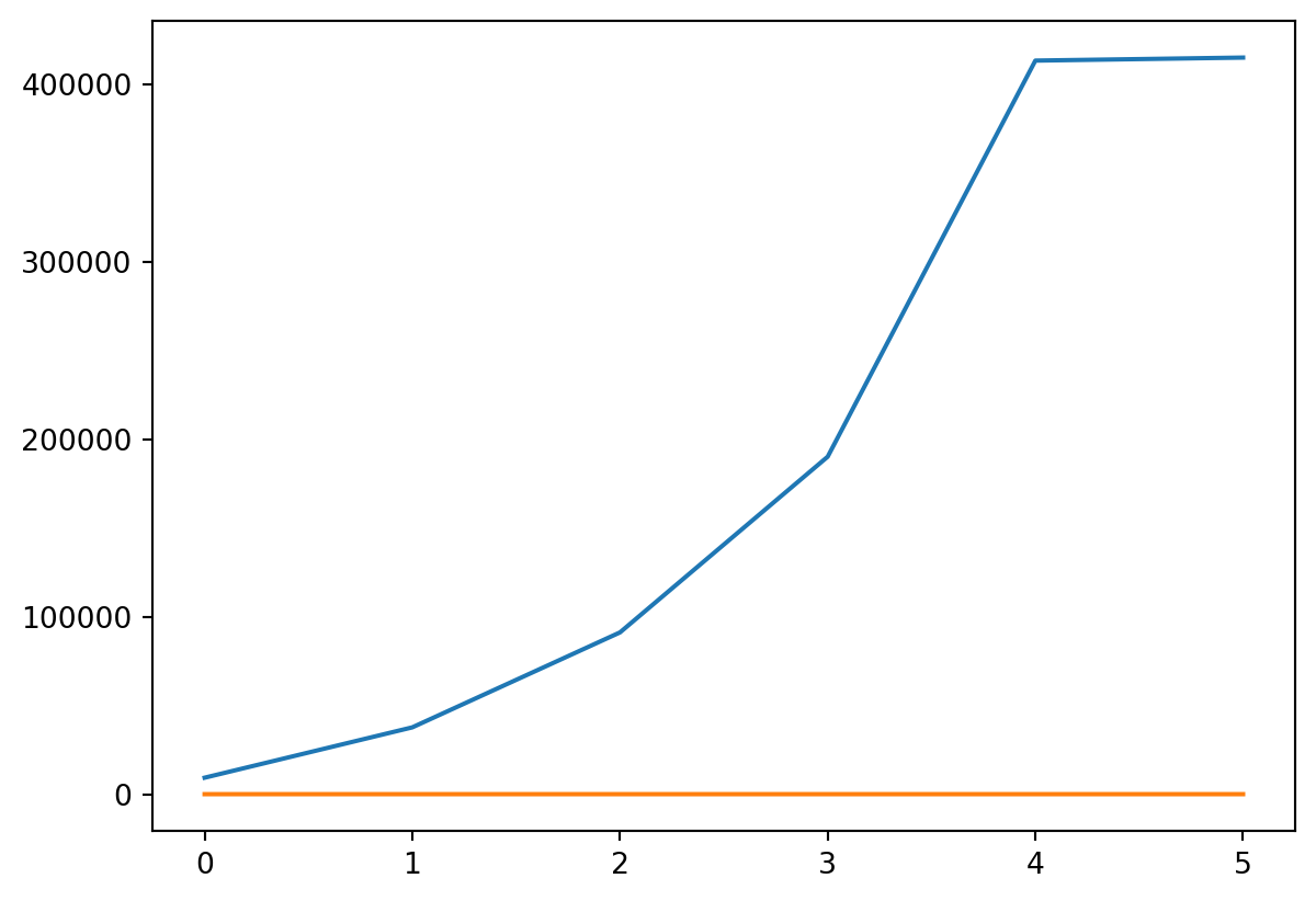
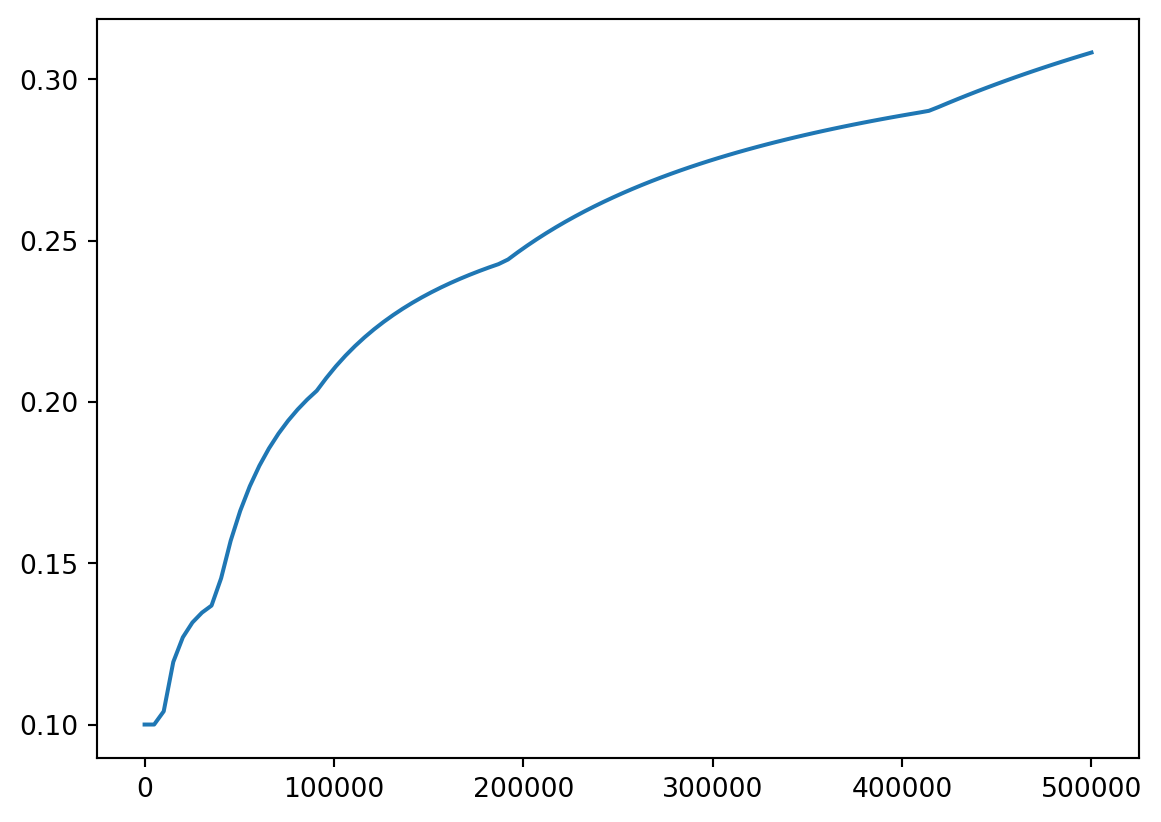
More fun
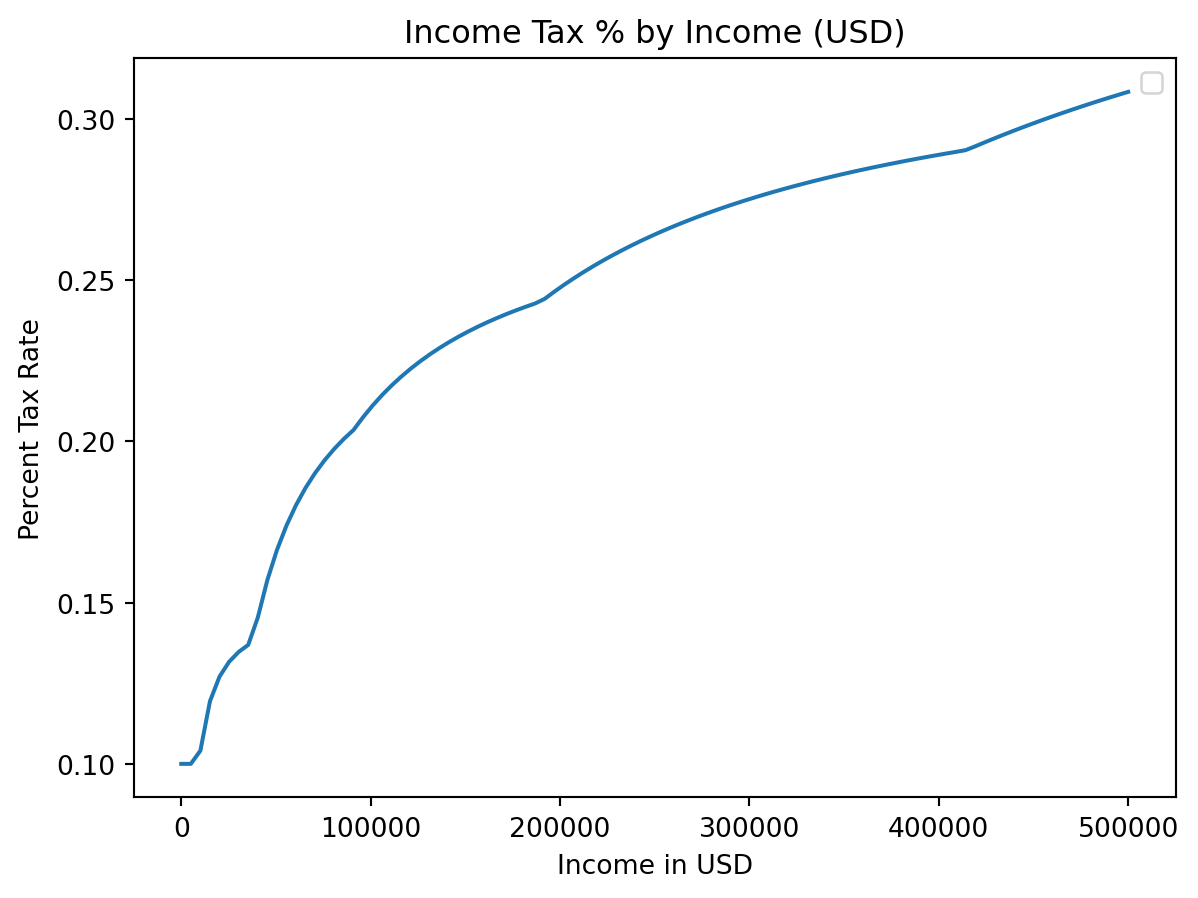
- We can also plot tax rate
Or Both
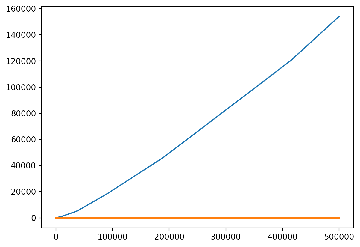
- Probably should put them on different scales!
Chart Elements
Well-formed Charts
- I learned charts should have:
- Labels on the vertical and horizontal axes
- A title
- A legend
- Let’s add these.
plt.title
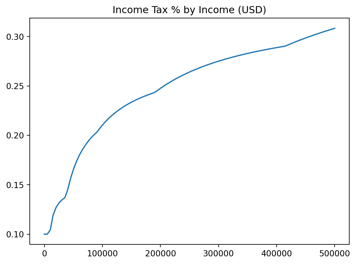
plt.xlabelandplt.ylabel

plt.legend
plt.title("Income Tax % by Income (USD)")
plt.xlabel("Income in USD")
plt.ylabel("Percent Tax Rate")
plt.plot(incomes, costs / incomes)
plt.legend() # We didn't label any of our plots!C:\Users\cd-desk\AppData\Local\Temp\ipykernel_20228\1652991527.py:5: UserWarning:
No artists with labels found to put in legend. Note that artists whose label start with an underscore are ignored when legend() is called with no argument.
label=
Annotation
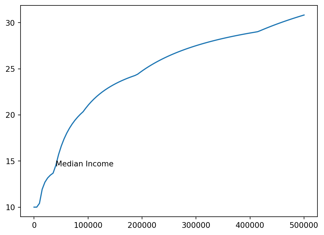
- We’ll add a note where median income (about 40k) is.
med_inc = 40000
med_tax = single_tax(40000)
med_pct = med_tax / med_inc * 100
xy = [med_inc, med_pct]
xy[40000, 14.428125]- We’ll use
plt.annotate
plt.annotate()
Using functions
- We can use functions to add anotations.
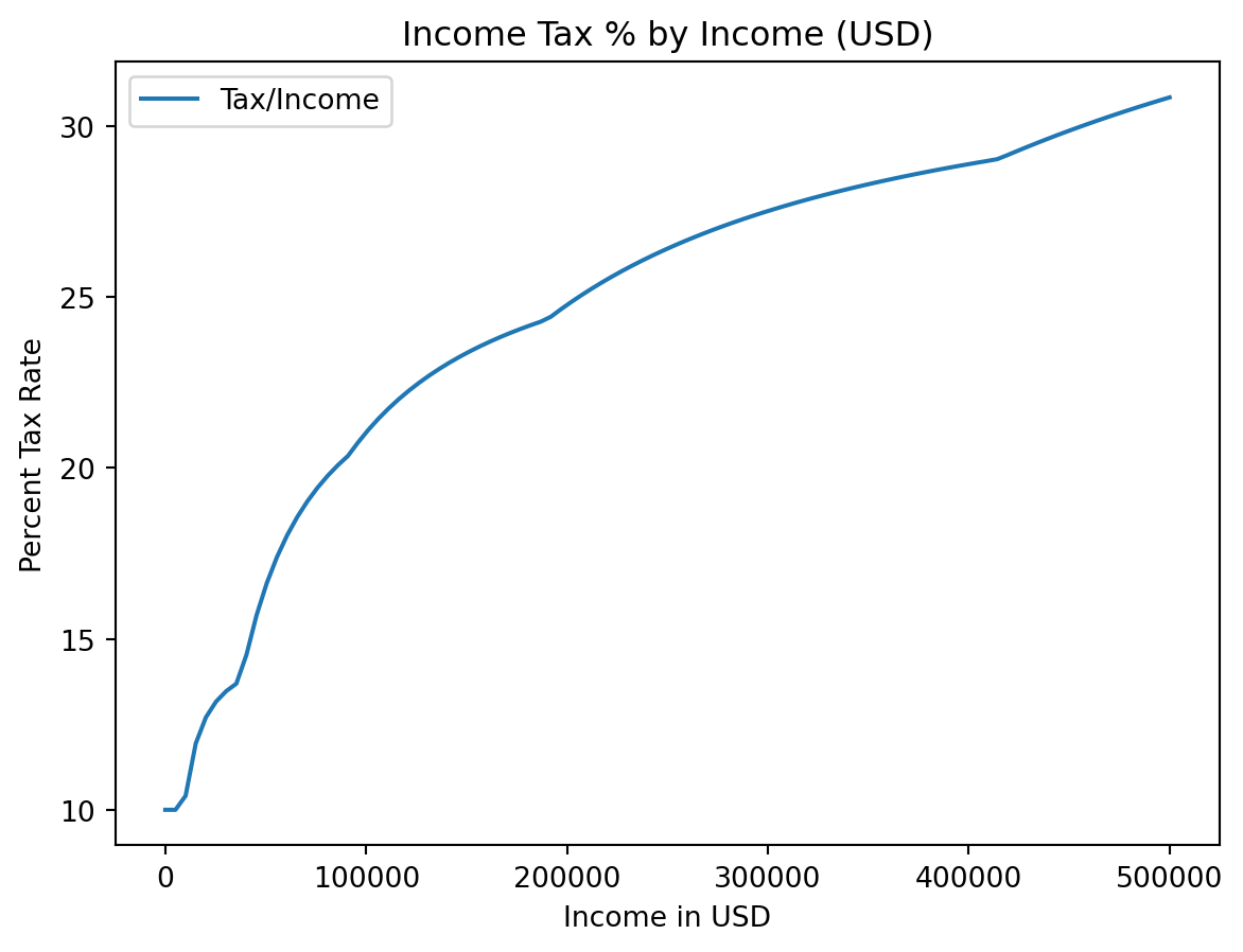
plt.plot(incomes, costs / incomes * 100, label = "Tax/Income")
add_note(115000, "CS Mid Career")
add_note(80000, "CS New Grads")
add_note(70000, "Physics New Grads")
add_note(55000, "All New Grads")
add_note(40000, "Median Income")
plt.title("Labor Market Outcomes of College Graduates by Major")Text(0.5, 1.0, 'Labor Market Outcomes of College Graduates by Major')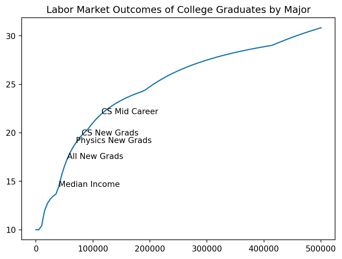
Multiple Functions
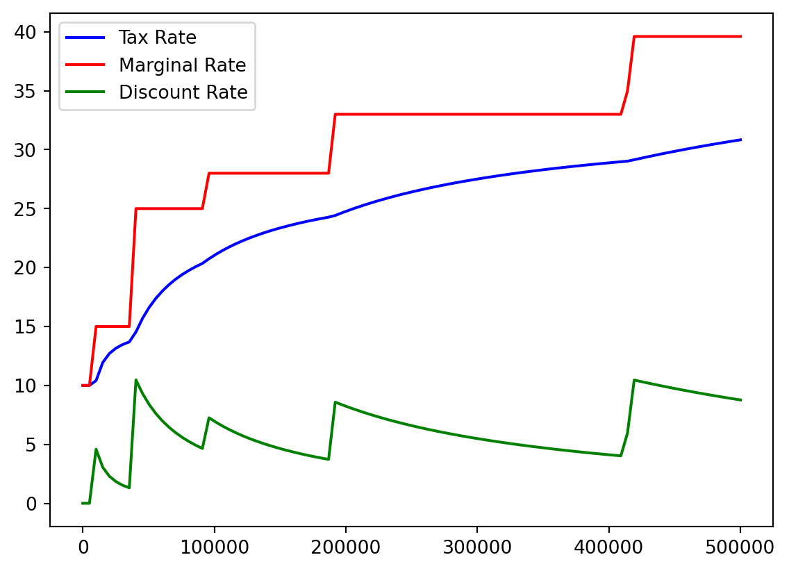
- I think it would be helpful to see actual tax percentage versus marginal tax percentage.
- No one actually pays the highest 39.6%!
- We recall our array:
Bracket %
color=
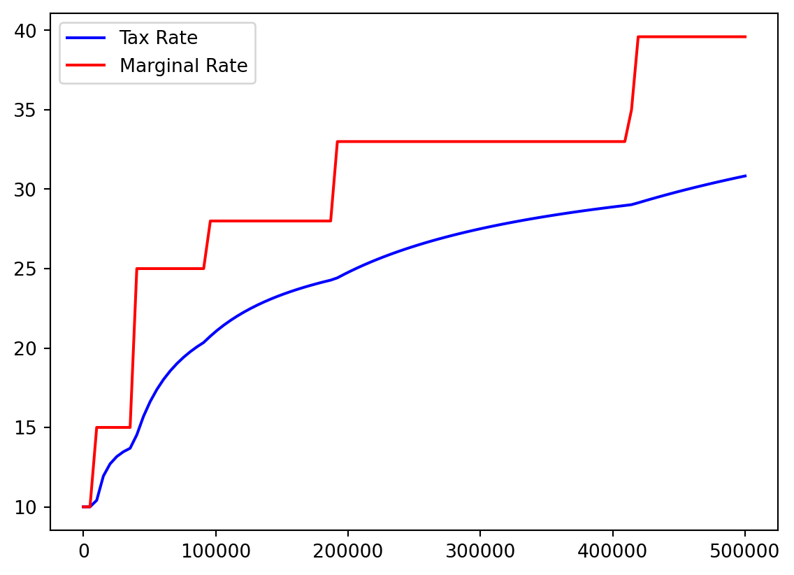
color=
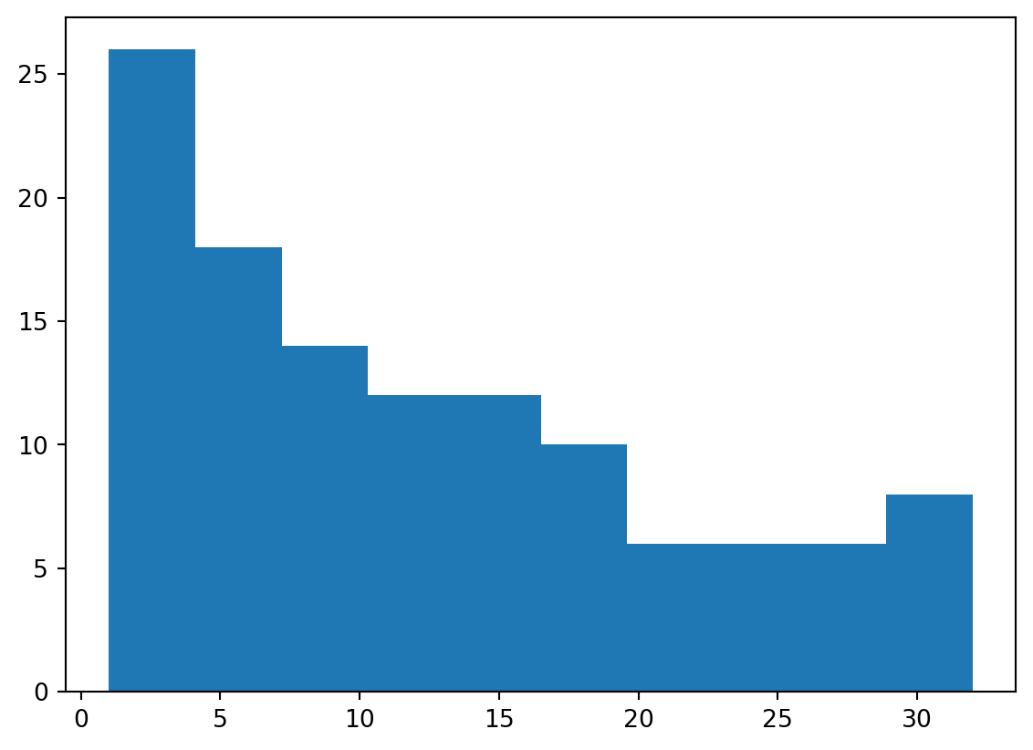
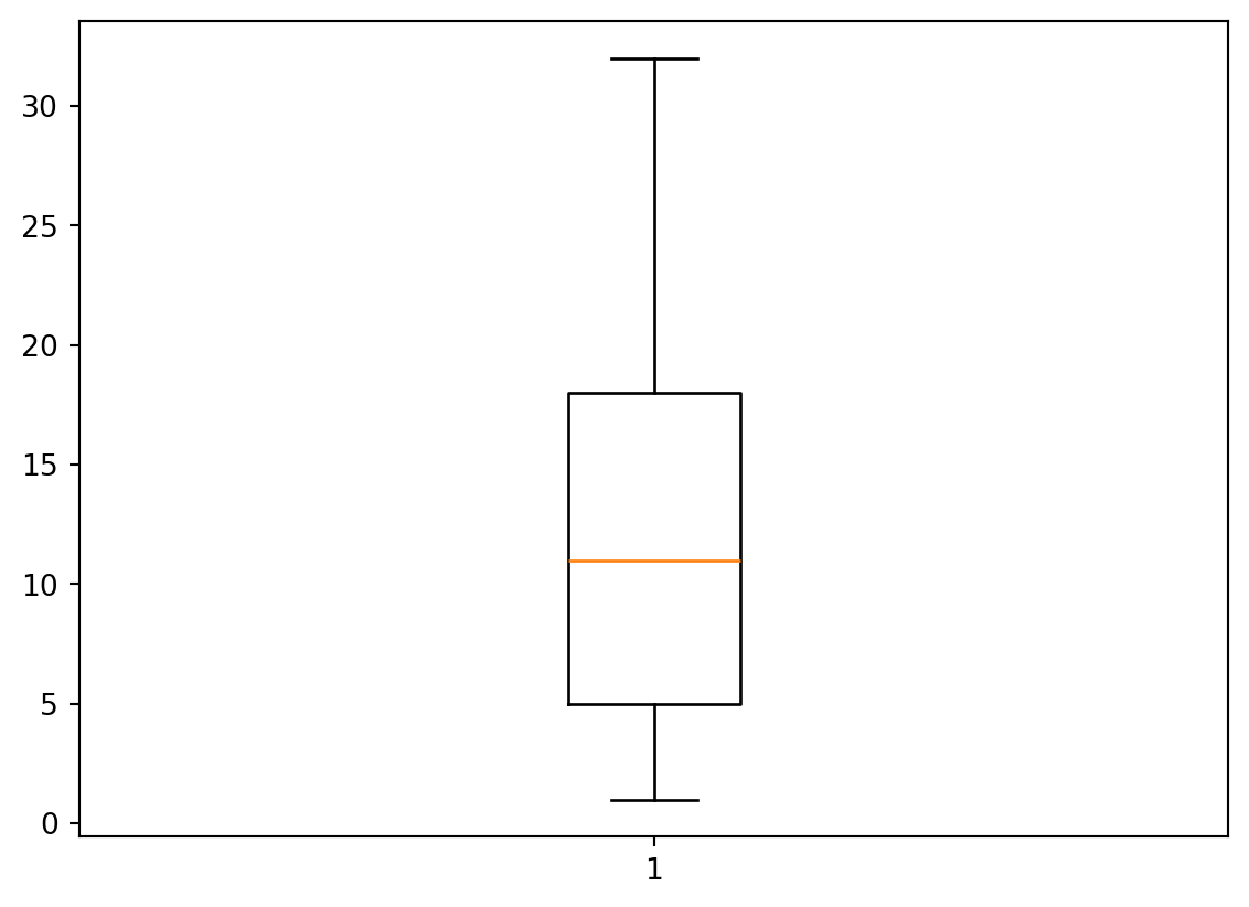
Histogram
More than lines
- We are not restricted to line plots (of course)
- Histograms, boxplots, and scatterplots are all popular as well.
- We’ll show a histogram quickly.
Electron Shells
- That first
2means:- There are two elements with a single electron shell
- One has
1of2electrons (Hydrogen) - One has
2of2electrons (Helium)
- So those elements have this many outermost electrons each:
Ordering Shells
- Let’s take a look at the distribution of how many electrons are present in the outermost shell.
- Basically, we need to take an
np.arange()or each element of thees
Accumulate
- We can just create some NumPy array and add to it over time.
- Since we are combining arrays we use
What?
- Hard to tell what is going on here.
array([ 1., 2., 1., 2., 3., 4., 5., 6., 7., 8., 1., 2., 3.,
4., 5., 6., 7., 8., 1., 2., 3., 4., 5., 6., 7., 8.,
9., 10., 11., 12., 13., 14., 15., 16., 17., 18., 1., 2., 3.,
4., 5., 6., 7., 8., 9., 10., 11., 12., 13., 14., 15., 16.,
17., 18., 1., 2., 3., 4., 5., 6., 7., 8., 9., 10., 11.,
12., 13., 14., 15., 16., 17., 18., 19., 20., 21., 22., 23., 24.,
25., 26., 27., 28., 29., 30., 31., 32., 1., 2., 3., 4., 5.,
6., 7., 8., 9., 10., 11., 12., 13., 14., 15., 16., 17., 18.,
19., 20., 21., 22., 23., 24., 25., 26., 27., 28., 29., 30., 31.,
32.])Histogram
Nicety
- I don’t really like seeing all that text about arrays and boxes and so on.
- I start plotting lines-of-code with
_ =_is a variable which, convention (just a social construction) means “ignore this”- This is a good way to say “I don’t care what this code returns but I do care what it prints, makes, saves, etc.”
Gallery
Histogram

Box
Pie
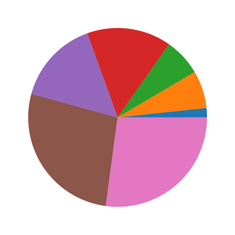
- This appears to be one color per “row” but we didn’t label the rows so it’s hard to say.
Many more!
- There are many more plot types that require having both two-dimensional data, the most famous being the scatter plot.
- Read more
- For now, it is tough to use other charts well, but soon we will learn to read data files and plot them, with
pandas.
Exercise
Credit
- This exercise, with great appreciation, is adapted from
- I reviewed the chemistry at play in:
Orbitals
- Those outermost electrons in an atom have to be somewhere.
- Using the aforementioned
plotly, it is possible to plot these orbitals interactively in 3D
Code
import plotly.graph_objects as go
# --- Constants and Orbital Parameters ---
# Atomic number (Z) for the hydrogenic atom.
# Z=1 for Hydrogen. You can change this to visualize for other single-electron ions.
Z = 1
# Principal quantum number (n) for the 3d orbital.
n = 3
# --- Radial Wavefunction R_3d(r, Z) ---
# This function calculates the radial part of the 3d orbital wavefunction.
# It is based on the formula provided by the user:
# R3d = (1/9√30) × ρ^2 × Z^(3/2) × e^(-ρ/2)
# where ρ (rho) is defined as 2 * Z * r / n for hydrogenic atoms.
def R_3d(r, Z_val):
"""
Calculates the radial part of the 3d orbital wavefunction.
Args:
r (numpy.ndarray): Radial distance from the nucleus.
Z_val (int): Atomic number.
Returns:
numpy.ndarray: The value of the radial wavefunction at distance r.
"""
# Calculate rho based on the principal quantum number (n=3 for 3d)
rho = 2 * Z_val * r / n
# The constant factor from the user's formula
constant_factor = 1 / (9 * np.sqrt(30))
# Calculate the radial part according to the user's formula
# Handles potential division by zero or NaN values if r is zero,
# as rho will be zero, leading to rho**2 = 0 and exp(-0) = 1.
radial_part = constant_factor * (rho**2) * (Z_val**(3/2)) * np.exp(-rho / 2)
return radial_part
# --- Angular Wavefunction Y_3dz2(theta) ---
# This function calculates the angular part of the 3d_z^2 orbital wavefunction.
# It is based on the formula provided by the user:
# Y3dz2 = √(5/4) × (3z^2 – r^2)/r^2 × (1/4π)^1/2
# This simplifies to √(5/16π) * (3cos^2(theta) - 1), where theta is the polar angle.
def Y_3dz2(theta):
"""
Calculates the angular part of the 3d_z^2 orbital wavefunction.
Args:
theta (numpy.ndarray): Polar angle (angle from the positive z-axis).
Returns:
numpy.ndarray: The value of the angular wavefunction at angle theta.
"""
# The constant factor from the user's formula, simplified
constant_factor = np.sqrt(5 / (16 * np.pi))
# Calculate the angular part
angular_part = constant_factor * (3 * np.cos(theta)**2 - 1)
return angular_part
# --- Create 3D Grid for Visualization ---
# Define the resolution of the 3D grid. Higher values mean better detail but slower computation.
grid_points = 60 # Number of points along each axis (x, y, z)
max_range = 25 # Maximum extent of the plot in each direction (arbitrary units, e.g., Bohr radii)
# Create 1D arrays for x, y, and z coordinates
x_coords = np.linspace(-max_range, max_range, grid_points)
y_coords = np.linspace(-max_range, max_range, grid_points)
z_coords = np.linspace(-max_range, max_range, grid_points)
# Create a 3D meshgrid from the 1D coordinate arrays
# 'indexing='ij'' ensures that X, Y, Z_grid have shapes (grid_points, grid_points, grid_points)
# Z_grid is renamed to avoid conflict with the atomic number Z.
X, Y, Z_grid = np.meshgrid(x_coords, y_coords, z_coords, indexing='ij')
# --- Convert Cartesian to Spherical Coordinates ---
# Calculate radial distance (r)
r = np.sqrt(X**2 + Y**2 + Z_grid**2)
# Calculate polar angle (theta)
# Using arctan2(sqrt(x^2+y^2), z) is more numerically stable than arccos(z/r)
# as it handles cases where r is zero or very small more gracefully.
r_xy_plane = np.sqrt(X**2 + Y**2)
theta = np.arctan2(r_xy_plane, Z_grid)
# --- Calculate the Full Wavefunction (psi) ---
# The full wavefunction is the product of the radial and angular parts.
# Handle potential runtime warnings for very small r values if they lead to issues.
# np.where is used to prevent division by zero for r=0 in R_3d, although the current R_3d
# implementation handles it gracefully. It's a good practice for general cases.
psi = np.where(r == 0, 0, R_3d(r, Z) * Y_3dz2(theta))
# --- Determine Isosurface Thresholds ---
# To visualize the shape of the orbital, we plot isosurfaces of the wavefunction (psi).
# The 3d_z^2 orbital has positive lobes along the z-axis and a negative toroidal (donut) lobe
# in the xy-plane. We will plot two isosurfaces: one for a positive psi value and one for a
# negative psi value to represent these lobes.
#
# We find the maximum absolute value of psi to set a reasonable threshold.
# The threshold determines the 'size' or 'extent' of the visualized orbital lobes.
max_abs_psi = np.max(np.abs(psi))
# Adjust this factor (e.g., 0.05 to 0.2) to change the size of the rendered orbital.
# A smaller factor will show a larger, more diffuse orbital.
threshold = max_abs_psi * 0.08
# --- Create Plotly Figure ---
fig = go.Figure(data=[
# Isosurface for the positive lobe (e.g., blue color)
go.Isosurface(
x=X.flatten(),
y=Y.flatten(),
z=Z_grid.flatten(),
value=psi.flatten(),
isomin=threshold, # Only show values at or above this positive threshold
isomax=threshold, # Create a single surface at this threshold
surface_count=1, # Draw only one surface for this data trace
caps=dict(x_show=False, y_show=False, z_show=False), # Hide caps for a cleaner look
colorscale=[[0, 'blue'], [1, 'blue']], # Solid blue color for positive lobe
showscale=False, # Hide the color scale bar
opacity=0.6, # Transparency of the surface
name='Positive Lobe (ψ > 0)', # Name for legend
showlegend=True # Show this trace in the legend
),
# Isosurface for the negative lobe (e.g., red color)
go.Isosurface(
x=X.flatten(),
y=Y.flatten(),
z=Z_grid.flatten(),
value=psi.flatten(),
isomin=-threshold, # Only show values at or below this negative threshold
isomax=-threshold, # Create a single surface at this threshold
surface_count=1,
caps=dict(x_show=False, y_show=False, z_show=False),
colorscale=[[0, 'red'], [1, 'red']], # Solid red color for negative lobe
showscale=False,
opacity=0.6,
name='Negative Lobe (ψ < 0)', # Name for legend
showlegend=True
)
])
# --- Update Layout and Scene Settings ---
fig.update_layout(
title=f'Interactive 3d_z² Orbital Visualization (Z={Z})', # Title of the plot
# --- Add or modify these lines for a dark theme ---
paper_bgcolor='rgba(0,0,0,0)', # Dark background for the entire figure
plot_bgcolor='rgba(0,0,0,0)', # Dark background for the plotting area
font=dict(color='white'), # White font color for better contrast
scene=dict(
xaxis_title='X', # X-axis label
yaxis_title='Y', # Y-axis label
zaxis_title='Z', # Z-axis label
aspectmode='cube', # Ensures equal scaling for all axes for correct shape representation
# Optionally set camera position for initial view
xaxis=dict(
backgroundcolor="rgba(0,0,0,0)", # Transparent background for axis planes
gridcolor="gray", # Gray grid lines
zerolinecolor="white" # White zero line
),
yaxis=dict(
backgroundcolor="rgba(0,0,0,0)",
gridcolor="gray",
zerolinecolor="white"
),
zaxis=dict(
backgroundcolor="rgba(0,0,0,0)",
gridcolor="gray",
zerolinecolor="white"
),
camera=dict(
eye=dict(x=1.5, y=1.5, z=1.5) # Adjust camera angle for better initial view
)
),
margin=dict(l=0, r=0, b=0, t=40), # Adjust margins
height=700, # Height of the plot
width=700, # Width of the plot
hovermode=False, # Disable hover to improve performance on large datasets
legend=dict(
x=0.01,
y=0.99,
bgcolor='rgba(255,255,255,0.7)',
bordercolor='Black',
borderwidth=1
)
)